To keep the public informed about swiftly changing information throughout the coronavirus disease 2019 (COVID-19) pandemic, scores of governments and agencies have used ArcGIS Hub to create open data sites. These sites help increase transparency and build trust in local government—and they’re especially important during a large event like a pandemic to communicate up-to-the-moment news and resources. With maps that show everything from community spread of the disease to updates on local school closures, these open data sites provide residents and local officials with the information they need to protect their communities, stay safe, prevent infections, and make data-informed decisions.
The following are several examples of open data sites, built with ArcGIS Hub, from across the United States that have given residents important resources and updates on COVID-19 throughout the crisis.
Maryland Provides Accurate and Timely Data
To coordinate content and updates going out to the community, the Maryland Department of Information Technology (DoIT) Geographic Information Office (GIO) created a site using ArcGIS Hub in partnership with several agencies, including the Maryland governor’s office, the Maryland Department of Health (MDH), and the Maryland Emergency Management Agency (MEMA). The hub site was designed to be an authoritative source of reliable information on COVID-19 and provide users with fast and easy access to resources.

“I want to instill confidence in Marylanders that their state government is providing accurate and timely data to all visitors to the site,” said Julia Fischer, director of data services for business intelligence and GIS at DoIT. “The data is accessible to all Marylanders and is providing a clear and definitive picture of the state’s response to the unprecedented events occurring right now.”
Fischer said the DoIT GIO team selected ArcGIS Hub to create the new site because the Esri platform is what she and her staff know best. The team members created the initial site in about four hours, coordinating with staff at MDH, MEMA, and the governor’s office so they could make content updates directly to the site.
The site includes a prominently placed dashboard that shares vital statistics regarding confirmed COVID-19 cases (broken down by county and ZIP code), hospitalizations, and testing results. The site also provides details regarding symptoms of COVID-19, how best to practice social distancing, links to local health departments, and more. It features practical resources such as links to information from the Centers for Disease Control and Prevention (CDC) and related highlights from governor Larry Hogan’s official website.
“We are providing a site that includes…quick access to interactive maps and dashboards, as well as data analytic capabilities, ensuring that Marylanders are well-informed about health and safety topics related to COVID-19 in Maryland,” said Fischer.
MDH continues to work to consolidate data to gain a clear picture of the statewide efforts to combat COVID-19, along with their effects. As such, the data featured on the site is derived from the work of MDH and its partners. Additional subpages that have recently been developed show the locations of congregate facilities and testing sites throughout the state to help visitors gain a clearer understanding of the impact of the pandemic.

I want to instill confidence in Marylanders that their state government is providing accurate and timely data to all visitors to the site.
The team updates the statistics on the site seven days a week and keeps refining it to improve its reliability and user experience. Since it launched on March 14, the site has had more than 214 million page views and almost 4.6 million users.
“I am immensely proud of the work my team has been doing,” said Fischer. “Transparency of information is everything. Governments have an obligation to communicate data and empower all of us to make informed decisions for ourselves, our families, and our communities.”
Montgomery County, Pennsylvania, Showcases the Power of GIS
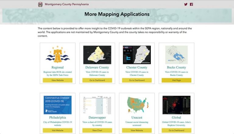
Officials in Montgomery County, Pennsylvania, established a site with ArcGIS Hub when the county recorded its first case of COVID-19 in early March. The initiative began with a simple story map that showed the location of COVID-19 cases in both the state and the county and has since evolved into a full hub site with maps, resources, and information on the pandemic.

“It’s turned into an information platform with a lot of links to resources and information—especially as we’ve gotten more cases. [Our residents] want to see maps and data and things like that,” said county GIS manager David Long, GISP. “The goal of our site is to…put information out in a timely manner and showcase the power of our GIS program.”
Long selected ArcGIS Hub because it integrated seamlessly with the GIS division’s existing ArcGIS platform.
“[Speaking] as a GIS professional, it’s not just the fact that it’s available to us and is already part of our platform, but the functionality is much better. I just feel like it’s easy,” he said. “It just allows me to be able to work in a platform that I’m familiar with.”
The Montgomery County hub site provides basic but vital information about COVID-19, including what the virus is, how to prevent getting it, and symptoms of the disease. The site also displays county-specific statistics such as the age, gender, and municipalities associated with COVID-19 cases; local county news; and updates from governor Tom Wolf, including his plan for reopening the state. In addition, the hub hosts public testing registration forms that residents can use to preregister for a COVID-19 test.
A range of resources are available as well, including information from the CDC, links to the Pennsylvania COVID-19 site and the Pennsylvania Department of Health, and the Johns Hopkins University dashboard that shows global cases. Dr. Valerie Arkoosh, chair of the Montgomery County Commissioners, holds daily COVID-19 press conferences that are streamed live on Facebook. Those are archived on the hub site and available for anyone to view.
A stand-alone business page, accessible from the site, was created for the Montgomery County business community. This page includes information, such as how to apply for business loans, and a capability that enables businesses to indicate whether they’re open or closed or are offering discounts. What’s more, with help from Google Translate, the GIS team made the main page of the hub site available in Korean to serve the county’s large Korean-speaking community.

ArcGIS Hub has made it simple to continually update our content.
Long and his team update the site daily after the county holds a press conference to release new numbers.
“I’ve been working remotely—all my staff has been—but we’ve been responsible for updating maps and the hub site daily,” said Long. “So even though it hasn’t been face-to-face, it has involved constantly contacting sources and verifying information daily.”
Since its launch on March 7, the site has received more than 2.75 million unique views, according to Google Analytics, with about 60 percent of those on a mobile device. For Long, an additional benefit of ArcGIS Hub is that it responds well to the mobile environment. Feedback on the site has been positive, and it’s been a big hit with county residents in particular, according to Long.
“ArcGIS Hub has made it simple to continually update our content,” said Long.
In addition to a regional hub site, he has developed mapping content and data that includes COVID-19 statistics from other Pennsylvania counties.
“This disease doesn’t stop at borders,” Long said. That’s why he and the GIS division are committed to continuing to provide the public with an array of up-to-date information.
County in Indiana Makes One-Stop Shop for COVID-19 Information
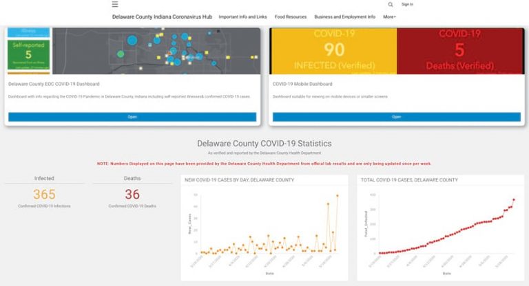
In Delaware County, Indiana, the Delaware County GIS Department manages a COVID-19 hub site in partnership with the Delaware County Emergency Management Agency and the Delaware County Health Department.

“The main purpose of our local coronavirus hub site is to be the official source for our community’s response to the COVID-19 epidemic,” said Delaware County GIS department’s GIS coordinator Kyle Johnson, GISP. “Having a one-stop shop for all the most important local information on the response to the pandemic was very important.”
Johnson had experience using ArcGIS Hub on a different project. He liked how easily it integrated with ArcGIS Online content, as well as its responsive design, so he thought it would be an ideal platform for the county’s COVID-19 site. Implementation was easy, he said, thanks to the drag-and-drop interface.
“Providing fast, important information to the public is always a challenge, especially during emergency situations. The ArcGIS Hub site and ArcGIS Online have made my job of disseminating information and making it available to the public much easier,” said Johnson.
The county’s Emergency Management Agency, which has been tracking self-reported illnesses and recoveries, is the primary data source for the site. A dashboard also gives users access to the State of Indiana’s dashboard and the Johns Hopkins University global dashboard.
When food distribution programs began in the county, the GIS department also included maps on the hub that showed the locations of the distribution centers. Additional pages on the site focus on local resources, including details on school closures and student food pickup sites and daily briefing videos from the county’s Emergency Management Agency. And now that the state has Back on Track Indiana, a road map to reopening, details of the plan are featured at the top of the page.

Providing fast, important information to the public is always a challenge, especially during emergency situations. The ArcGIS Hub site and ArcGIS Online have made my job of disseminating information and making it available to the public much easier.
Two GIS department staff members update the site multiple times a day. The ArcGIS Hub site launched on March 11, and as of May 18, it had received more than 87,000 item views, with a maximum daily view of over 4,000.
“So far, all the feedback has been good,” said Johnson. “Local officials like having important information on COVID-19 in one place, and our community can stay informed on this pandemic, which has impacted our state and community.”
University of South Florida Collaborates with the Community It Serves
The Digital Heritage and Humanities Collections GIS team at the University of South Florida (USF) in Tampa developed the Florida COVID-19 Hub site with both a regional and statewide focus. The site—a collaboration with research director and principal investigator Lori Collins; GIS manager and lead developer and designer Benjamin Mittler, GISP; GIS analyst Garrett Speed, GISP; and several PhD and graduate students—is designed to provide a platform for data access, research, and visualization.

“We are trying to help serve our campus researchers and engaged community of learners and educators, as well as the broader local and regional areas,” said Collins. “At this time, spatial data and its relationships to societal function and news are of vital importance.”
The GIS team chose ArcGIS Hub because of its ability to host multiple types of apps and data. Also, a number of agencies and data creators in Florida were already building GIS dashboards that the team knew could be quickly incorporated and expanded on, using a hub approach.
“We chose to not duplicate efforts but be inclusive and collaborative from the start, making ArcGIS Hub an obvious choice for building out an application like this,” said Mittler. “ArcGIS Hub allowed us to easily harvest data from other sources and display [it] in a simple way. Additionally, the Hub interface allowed us to add several important elements to our page with little to no coding.”
“We wanted to provide people with a tool where they could just sort of easily land and get the resources they need to make on-the-ground decisions but also predictively look at things,” said Collins. “ArcGIS Hub provided us with an easy mechanism to serve data out that way and to continue to add and grow the platform as new needs arose.”
The Florida COVID-19 Hub site includes the hub app, four custom dashboards, one web app, nine web maps, two feature services, and nine feature services streamed from government agencies. The statistics, map, social media, and featured applications sections of the dashboard were all created using built-in ArcGIS Hub functionality. The site also has a map that displays the Florida case count by county, with symbology that emphasizes the largest outbreaks. In addition, a custom layer examines cases and deaths related specifically to nursing homes.
“The nursing home research began when the state started putting out spreadsheet information on this area of high concern in Florida,” said Collins. “We have now expanded this to spatially examine trends and case numbers across the state. To the best of our knowledge, we are currently [as of mid-May] the only source for facility location information using GIS.”
Resources on the site include embedded Twitter feeds for the Florida Department of Health, the University of South Florida, Hillsborough County, and Pinellas County to ensure that users get real-time information on local and statewide closures. Cards on the site link to local and national news sources for additional information as well.

Our ArcGIS [Hub] site has become a really good way to collaborate and be a part of the community that we serve.
The hub also connects to two different sources of spatial data. The first is an ArcGIS Online group site with curated and updated data that’s relevant to COVID-19. The second is a storage folder that the Department of Health uses to export and archive data downloads each day.
The Florida COVID-19 site has been viewed about 500,000 times. Several USF faculty members are using its tools and data and are beginning to organize and share their own research through the platform.
“We are working with researchers in public health, education and policy, environmental sciences, business, data science, and geography—all coming together around the need to solve real-world problems with spatial data,” said Collins.
Mittler also said that the public has found the hub useful. It’s getting shared a lot, and there’s increasing social media engagement around it.
USF libraries, which the GIS team is part of, plans to help with metadata and paradata creation. This will allow people to reuse the data in the long term and conduct continued studies of the pandemic in Florida.
“We’re trying to be a good partner in our community and serve [this] data out in really usable, ready-made formats to keep policy makers, educators, researchers, and the public informed,” said Collins. “Our ArcGIS [Hub] site has become a really good way to collaborate and be a part of the community that we serve.”

