For business professionals who have little to no training in GIS, ArcGIS for Microsoft 365 offers a suite of mapping tools with user interfaces (UI) and user experiences (UX) that are consistent with the Microsoft 365 products they use every day.
The latest releases of ArcGIS for Power BI, ArcGIS for Office, and ArcGIS for SharePoint come out of more than six months of design exploration that sought to give users an experience similar to each of these Microsoft applications. The result is a set of tools that makes mapping and GIS more accessible to people who are more comfortable working in documents and spreadsheets than with points, lines, and polygons.

The Benefits of an Integrated UI/UX
An integrated user experience is critical for technologies that span different products. This complementary method of development is a major trend in UI/UX design, and it has the potential to enhance how users perform various tasks in an app or on a website.
For example, online shoppers for years have used third-party payment systems that are integrated into popular e-commerce websites to pay for goods and services. Financial institutions took notice, and many have introduced their own versions of extensible online payment methods that can be embedded in websites and used in mobile banking apps. The difference between a third-party system and one developed by a bank is that the latter is tied to the user’s financial institution, making it easier to access funds and eliminating the need for that third party. This is one benefit of a fully integrated user experience: that customers would want to use their bank’s UI/UX on an e-commerce website rather than that of a potentially unfamiliar third party.
A More Seamless Experience for Power BI Users
To begin the process of making the UI/UX of ArcGIS for Microsoft 365 more consistent with the latest Microsoft design patterns, the location analytics team at Esri started with ArcGIS for Power BI. This product allows business intelligence analysts to geo-enable their data and add interactive maps to their reports, providing insight into where things are happening in the real world.
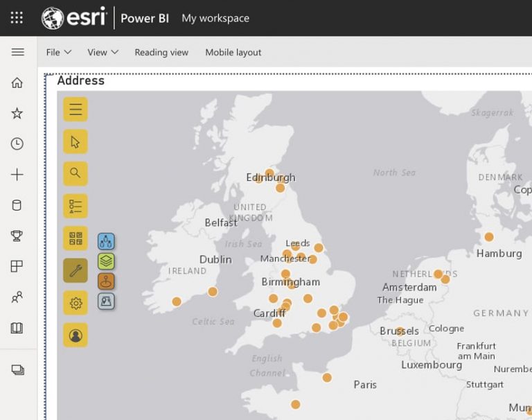
Based on customer feedback, the team at Esri focused on making the two technologies more seamless. For instance, the ArcGIS app now leverages Microsoft Power BI’s field wells, which help users manage their data to visualize it on a map. Building on Power BI’s native UI/UX, users of ArcGIS for Power BI can now select what map tools are accessible using the Power BI visualization pane. This allows more of the map to be visible.
The new version of ArcGIS for Power BI also introduced the concept of radial menus, or pie menus, which offer a more intuitive menu experience that maximizes the map area. With radial menus, users can complete a task in three or fewer clicks, whereas before, it wasn’t uncommon to have to engage that mouse or track pad four or more times to carry out a task.
The Power BI community gave the overall UX of this new version of ArcGIS for Power BI positive reviews. Taking that, the location analytics team at Esri forged ahead with creating a consistent look and feel across all the Microsoft 365 products that ArcGIS technology integrates with. The team wanted to make it easier for users to leverage the power of location intelligence in ArcGIS for Office and ArcGIS for SharePoint, too.
Expanding the New UI/UX to Other Products
Whether users are working in Microsoft Excel with data that needs to be visualized on a map, or they’re in Microsoft SharePoint trying to geoenable data stored in lists and connect files in document libraries to locations on a map, the team at Esri wanted the GIS experience in these Microsoft products to be consistent.

To maintain a visible and usable map area, the location analytics team introduced the concept of map tools to ArcGIS for Office and ArcGIS for SharePoint as well. The map tools were redesigned using square buttons with rounded corners to give them more of the button appearance used natively in Microsoft Office and Microsoft SharePoint. There are also options to expand and collapse the tools. All this allows for a more integrated experience, making it easier for Microsoft users to perform mapping and location analytics tasks.
Additionally, the team designed and built an internal library of common UI components that are fully customizable for ArcGIS for Microsoft 365 products. Not only did the library help with the redesign of the entire ArcGIS-Microsoft integration—to make it more modern—but it also makes it easier for the team to implement changes across all ArcGIS for Microsoft 365 products in the future. When any new features are developed, they’ll become part of this common library, too, so that all ArcGIS for Microsoft 365 products inherit them. The library is extensible as well, meaning that while the features and elements can be used across Microsoft 365, they can also maintain the look and feel of the individual products.
Consistent Design Changes Across the ArcGIS-Microsoft Ecosystem
The most important design change that Esri made to its ArcGIS for Microsoft 365 suite of products was using Microsoft’s Fluent UI—a set of open-source UX frameworks for apps that share code, designs, and functions—to provide a smoother user experience. This design language is employed extensively across the Microsoft 365 apps, so it made sense to implement the same color schemes, shapes, patterns, textures, and layouts in ArcGIS for Power BI, ArcGIS for Office, and ArcGIS for SharePoint. Fluent UI’s rich set of APIs for various platforms also makes it easier to incorporate accessibility options, support globalization, and improve performance.
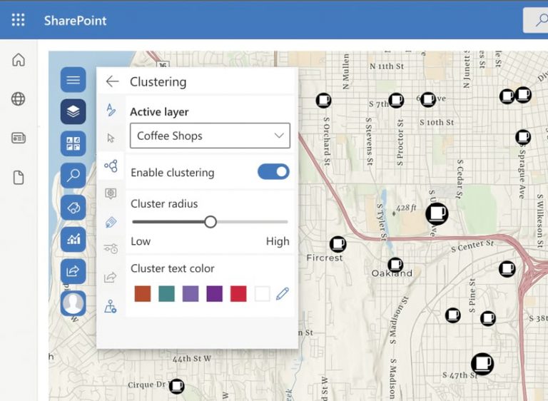
Indeed, in ArcGIS for Office and ArcGIS for SharePoint, users now see very similar map tools. The Clustering tool, for example, which helps users cluster together points in a map to make the data more legible, is almost identical in both programs. That’s because it’s based on the design components from Fluent UI. Users will also see that the updated labeling feature has a complementary style that even shows more of the map, making it easier and more intuitive to use than it was before.
Positive Feedback Drives an Ongoing Process
The latest designs for ArcGIS for Office and ArcGIS for SharePoint were released in August 2021, and so far, the user response has been positive. Esri’s location analytics team will continue to evolve the products’ design according to updates Microsoft makes to its design patterns, as well as user feedback.

