Knowing when and where the air quality is good, bad, or somewhere in between is important to Southern Californians. While the air in greater Los Angeles is cleaner than it was from the 1950s through the 1980s, there are still times when and places where it’s smart to stay indoors or skip strenuous exercise.
Getting accurate, up-to-date, and location-based air quality information is now just a tap away, courtesy of a new mobile app from the South Coast Air Quality Management District (South Coast AQMD). Developed in part using Esri’s ArcGIS Runtime SDKs, the South Coast AQMD app offers users air quality updates and other useful information in four Southern California counties: Orange County and major portions of Los Angeles, Riverside, and San Bernardino Counties, including the Coachella Valley.
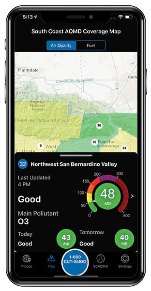
Maps are an integral part of the South Coast AQMD app. People who download the app will find a map showing the current and next day’s air quality information and another map displaying locations of alternative fuel stations for places they select. By enabling the geolocation features on the app, users will receive the most up-to-date air quality information in their current city.
“We are used to checking the weather on phones, and [we] wanted to make it as easy to get our air quality,” said Jo Kay Ghosh, South Coast AQMD’s health effects officer.
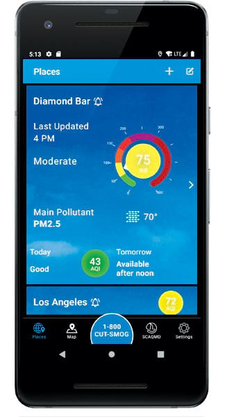
The app, available for Android and iOS devices, includes the following information:
- Current hourly location-based air quality readings displayed on a color-coded map
- Current hourly air quality index (AQI) readings shown on a corresponding color-coded dial
- The air quality forecast for the next day
- An animated background for current weather conditions
- The main pollutant in the air—ozone, PM2.5, or PM10
- The current temperature
- A map of alternative fuel stations based on location and fuel choice (electric, hydrogen, clean natural gas [CNG], or propane), along with driving directions
- A phone number to report air quality-related problems
- South Coast AQMD alerts, announcements, and events
South Coast AQMD acts as the pollution control agency for vast portions of Los Angeles, Orange, San Bernardino, and Riverside Counties. It is in charge of monitoring and controlling stationary sources of air pollution, from area factories to neighborhood dry cleaners. Recent wildfires have exacerbated the pollution problem, too.
The agency keeps the public informed about the air quality in the 10,743-square-mile region it covers. Knowing what the air quality is like on any given day or even hour is important to all estimated 17 million residents but especially the elderly, young children, and those with conditions such as asthma or heart problems. The American Lung Association, in its recent State of the Air report, named greater Los Angeles the smoggiest area in the country. It’s recommended that people sensitive to air pollution, including ozone or particulate matter (PM), avoid or limit outdoor activities or even stay indoors on certain days.
Ghosh said the app offers real-time air quality information plus the forecasts for the next day, which are available after noon, because “the level of air pollution can change throughout the day.” She added that newly available hourly AQI updates can help people plan for when they exercise outdoors.
A Visually Pleasing App
Several years ago, South Coast AQMD used ArcGIS Online to create a browser-based map showing air quality conditions and had dabbled with an earlier version of a mobile app. But when Ron Moskowitz came on board as the agency’s assistant deputy executive officer for information management in 2017 (he’s now the deputy executive officer and chief information officer), he decided to up the ante technologically by totally redesigning the mobile apps.
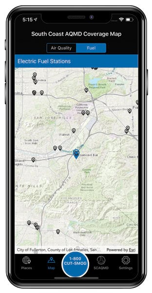
Moskowitz said he envisioned creating a “one-stop shop” app where people could find the most relevant information from South Coast AQMD. He wanted both the iOS and Android versions to be visually pleasing with maps and other indicators that display air quality data and alternative fuel station locations. In addition, Moskowitz thought the app should be easy to navigate and provide people with a way to connect with South Coast AQMD either by reporting air quality issues using the 1-800-CUT-SMOG number or finding the times and locations of South Coast AQMD meetings they could attend.
“I really wanted to create something that engaged the public [and was] simple and easy to use,” Moskowitz said. “We developed a beautiful app that is intuitive.”
ArcGIS Runtime SDK for Android and ArcGIS Runtime SDK for iOS were used to add mapping capabilities to the apps and consume content and services from ArcGIS Online.
“We are using the SDKs to render those maps. The features are hosted in ArcGIS Online,” Moskowitz said.
The AQI values in the dial are retrieved from feature attributes using ArcGIS Runtime SDKs, too.
Moskowitz said ArcGIS Runtime worked well for this project and that the mapping features were easy to integrate into the app.
“It met all our needs of what we were trying to communicate,” he said. “And we had good support from Esri.”
Making Data Understandable
The maps in the South Coast AQMD app and the ArcGIS Online map use colors to display the AQI levels geographically. For example, on a day in June, the map of both Riverside and San Bernardino Counties was colored yellow for moderate, meaning the AQI was between 51 and 100. However, the map of east San Gabriel Valley in Los Angeles County was colored orange for unhealthy for sensitive groups, meaning the AQI was in the 101–150 range.
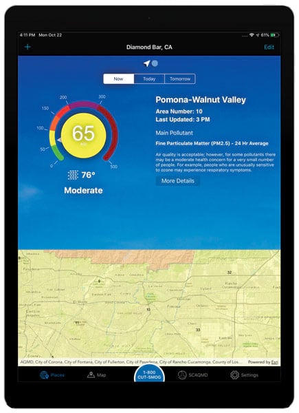
“Using maps and color-coded dials helps communicate information visually, making data such as the AQI values easier to understand,” said Jia Yuan Li, a South Coast AQMD systems and programming supervisor who worked on the app project. “Colors help [people] interpret the data. It is The Science of Where—data has to be interpreted to be understandable, and that’s where the map really comes in.”
The air quality maps also display numbers from 1 through 38, which represent the locations of 38 source receptor areas (SRA) within South Coast AQMD’s jurisdiction. Each SRA has at least one Environmental Protection Agency (EPA)-approved air quality monitor. Selecting the number reveals the area being monitored (e.g., 1 is for central Los Angeles), its AQI value, the reading time, the main pollutant, and more.
The app also lets users choose one or more areas they want to keep track of. They just tap the Places icon at the bottom of the app and use the plus sign (+) to add a new place, either with the name of a city or a ZIP code. Users can also set up air quality alerts based on the color level they select in the Air Preferences setting (green, yellow, orange, red, purple, and dark red).
“We recommend setting it to orange or higher,” Li said, adding that otherwise, you might be peppered with too many alerts. “We don’t want it to be an app that’s intrusive.”
Recently, the app received two awards from Government Technology (GovTech) and AT&T for technology innovation in the Citizens category, while Moskowitz was recognized in the Leadership category.
Future plans for the app include making the AQI data more granular on the map—something that would be possible as more sensors are added throughout Southern California.
“You could find out the air quality in your neighborhood,” Moskowitz said.
