Get Started Building Web Apps with ArcGIS Experience Builder, Using the Foldable Template
Esri recently released ArcGIS Experience Builder, a cloud-based app that enables you to deliver responsive web experiences without writing any code. You can create apps and/or pages that contain 2D and 3D maps, text, and media. You can focus on a single type of content or combine and link many types of content to create a complete experience and destination for your audience.
To create an experience, you just drag, position, and configure widgets such as maps, images, text, and tools. You also can add triggers and actions to make widgets work together within a single app and across multiple pages. To start an experience, use an existing template or create one from scratch. You can also save your work as a new reusable template. ArcGIS Experience Builder is built into ArcGIS Online, so you can leverage all your existing content.
Get more information on the basics: the ArcGIS Experience Builder user interface and feature overview and the ArcGIS Experience Builder product description.
The tutorial that follows shows you how to get started working with ArcGIS Experience Builder by building a simple, mapcentric experience using the Foldable template.
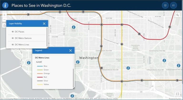
You can view the completed experience and follow along by using the Places to See in Washington D.C. web map. Sign in to your ArcGIS account and save the web map to use it in this tutorial.
Create a Mapcentric Experience
You can use Experience Builder to build a variety of apps. Follow these steps to create a simple, mapcentric experience.
Step 1—Open the app launcher and click Experience Builder.
You will see a gallery where you will find experiences that have been created by or shared with you or are publicly available.
Step 2—Click Create New.
This step advances you to the template gallery, where you can choose from the available templates and begin creating a new experience.
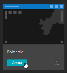
Step 3—Choose a template.
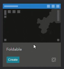
The template gallery contains a variety of default templates as well as templates that have been shared with you. To get more information about any template, point to the thumbnail.
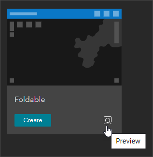
You can also preview the template.
Locate the Foldable template and click Create to begin.
Step 4—Explore the template.
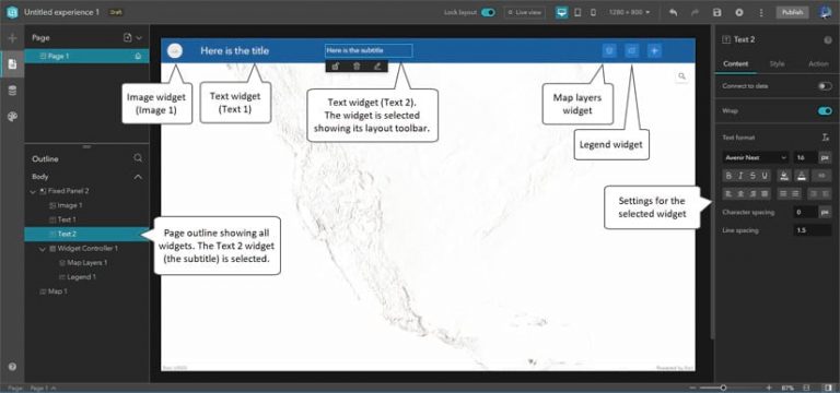
Foldable is a basic template for an appcentric experience. It includes widgets for a title, subtitle, map (including standard zoom tools), legend, and layer list.
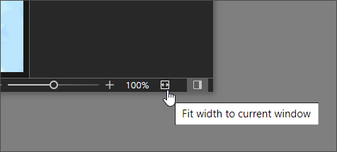
If you can’t see all the widgets, fit the app to the current window.
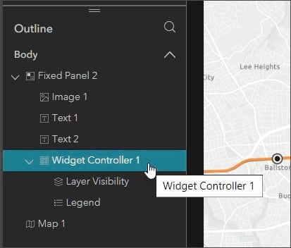
In the panel on the left-hand side, you will see the outline of the current page. Click the arrows to expand the view to show all the widgets in the template. Click any widget—or select one in the outline—to view its current settings and make changes in the settings to the panel on the right.
Additional tools on the Experience Builder header bar will be used to create the experience.
Lock layout prevents accidentally moving and removing some widgets. Live view lets you work with the app using its current settings. Additional tools let you preview the app on different-sized devices, and there are also undo/redo, save, and publish tools.
In the steps that follow, each widget will be configured to create your appcentric experience.
Configure the Map Widget
First you will connect to a map and add tools. You will do this by adding a map to the map widget, and adjusting settings to add a search tool, zoom tools, and a home button.
Step 1—Select the map widget to view its settings.
In the center of the builder, you will see the map widget with a placeholder map. Click the map widget to select it or select it from the outline panel to display the current settings.
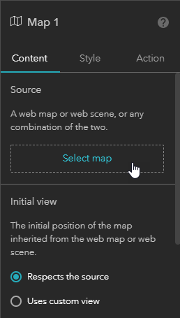
Step 2—Select the map used by the map widget.
In the settings panel, click Select map.
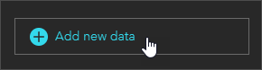
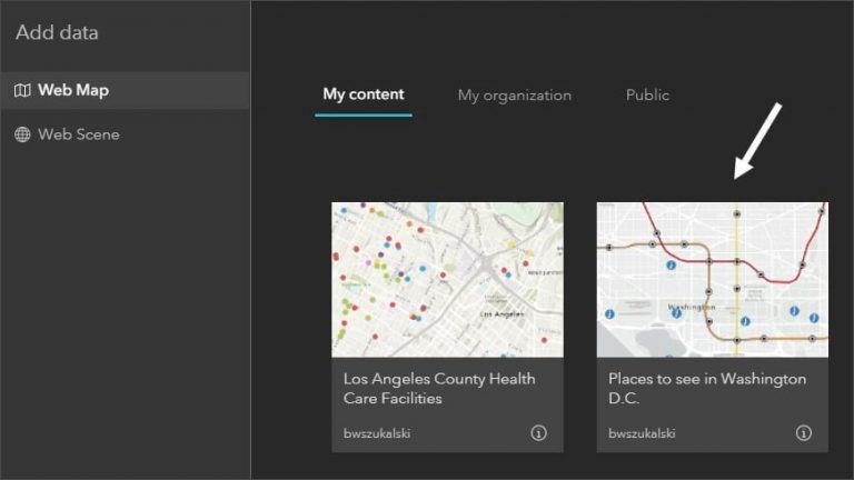
At the bottom of the Select data panel, click Add new data. Note that you can also search or filter for type.
The Add data panel will display available maps. If you have saved the example map used in this tutorial, locate it and select it, or choose any map you have. When finished, click Done.
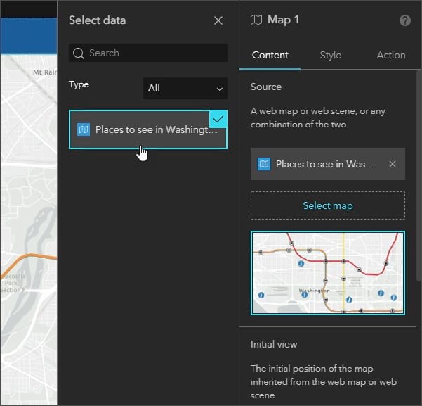
Click the map in the Select data panel. The settings panel for the map widget will update and the map will be displayed in the application.
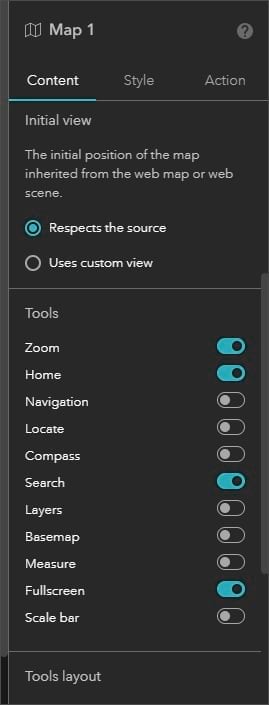
Step 3—Review other settings.
Now that the map has been added to the widget, you can change other settings such as the initial view, the tools that appear, and the tool layout. Choose the settings you prefer. Below you will see the Tools section showing the toggles. Choose Zoom, Home, Search, and Fullscreen.
Configure the Legend Widget
Next, you will configure the legend. The template contains the Legend widget at the upper right-hand side of the application. It displays the legend for visible layers in the map. Follow the steps below to change the title.
Step 1—Select the Legend widget.
Click the Legend widget or select it from the outline to view the current settings.
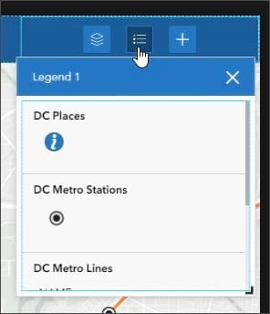
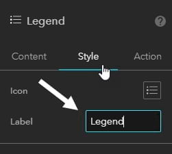
Step 2—Change the title.
Click the Style tab and edit the Label title. By default the Label title is the widget name—in this case, Legend 1. Change the title to Legend.
Configure the Map Layers Widget
The Map Layers widget displays the layers in the map and lets you choose what options are available to interact with them, such as toggling visibility, zoom, and transparency. In the following steps, you will add the ability to toggle layer visibility and change the title of the widget.
Step 1—Select the Map Layers widget.
Step 2—On the Content tab of the widget settings, adjust the slider to enable Toggle layer visibility.
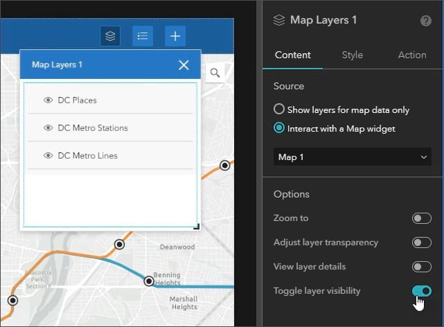
You can experiment with other options and use Live view to examine how they work.
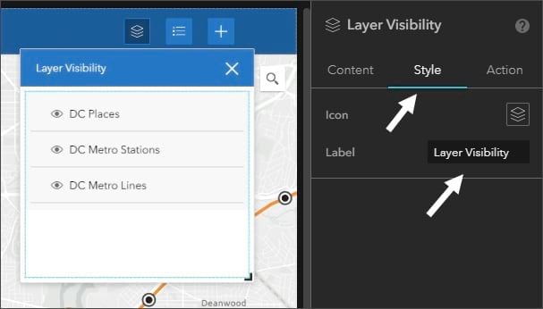
Step 3—Change the widget label.
On the Style tab, edit the label to change it from the widget name, Map Layers 1, to Layer Visibility.
Click the Close button to dismiss the Map Layer widget.
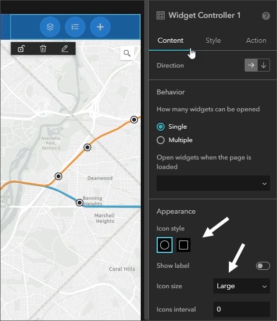
Configure the Widget Controller Widget
The Widget Controller widget is a container for other widgets—in this case the legend and map layer widgets. In the next steps, you will change the shape and size settings that will be applied to all widgets within the widget controller.
Step 1—Select the Widget Controller 1 widget from the outline.
Step 2—Change the size and shape of tools in the container.
In the Content tab’s Appearance section, set the icon style to circular and the size to Large.
Step 3—Give the app user the ability to open multiple tools at once.
By default, only one widget at a time can be opened from the widget controller. For example, the app user can open the legend tool or the layer tool, but not both at once.
In the Behavior section of the settings panel, choose Multiple to enable more than one widget to open at once, and set them to stack when opened.
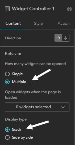
You can also set one of the widgets to open automatically when the user opens the app. Experiment to see what you like, using Live view to see how your settings work.
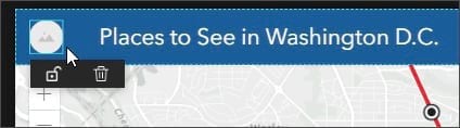
Edit Title and Subtitle Text Widgets
Next, you will edit the title bar. Two text widgets—one containing the title and the other the subtitle—can be found within the fixed panel widget above the map. You will remove the subtitle and expand the title.
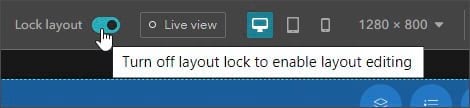
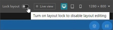
Step 1—Unlock the layout.
To remove the subtitle and make other adjustments, you must unlock the layout. Turn off Lock layout, on the Experience Builder header bar.
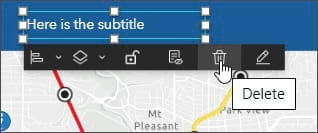
Step 2—Remove the subtitle.
Select the subtitle text widget. Click the Delete symbol on the layout toolbar.
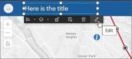
Step 3—Change the title.
Select the title text widget and click the Edit symbol on the layout toolbar.
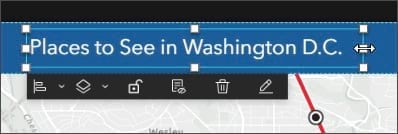
Change the title to Places to See in Washington D.C. You will have to resize the text widget to display the entire string. Click the Text widget to show the handles, then grab and drag the middle right-hand side handle to widen the text widget.
Step 4—Lock the layout again to avoid any accidental movement of widgets as you work with them.
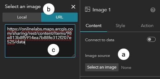
Configure the Image Widget
The image widget is at the top left-hand side of the application and is contained within the fixed panel widget. In the steps that follow, you will change the image that’s displayed and add a link from the image to a website.
Step 1—Select the image widget by clicking it or selecting it from the page outline.
Step 2—Add the image using a URL.
(a) In the settings panel, click Select an image.
(b) Select URL.
(c) Copy the following and paste it into the URL input:
https://www.arcgis.com/sharing/rest/content/items/98e813b8f5914ea7b88fe312f207e525/data
Enter a carriage return after you paste the URL.
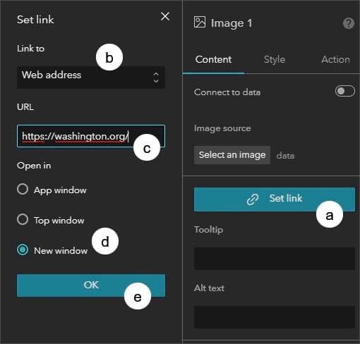
Step 3—Add a link to a website.
(a) In the settings panel, click Set link.
(b) Choose Web address from the drop-down list.
(c) Copy the following and paste it into the URL input: https://washington.org/
(d) Click New window so the URL will open in a new window.
(e) Click OK when finished.
Configure the Fixed Panel Widget
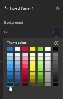
The top of the application is a fixed panel widget. In the next steps, you will change the color settings of the widget.
Step 1—Click the Fixed Panel 1 from the outline.
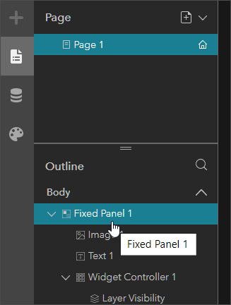
Step 2—In the widget settings, choose a different background fill color to highlight the tools and text.
Finalize the App
You can go back and make additional adjustments or reconsider settings, using Live view to see how things work. To create the final app shown below, the layout was unlocked and the heights of the fixed panel and map widgets were adjusted within the application body. The image widget and title were also resized.
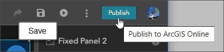
When finished, click Save. Click Publish.
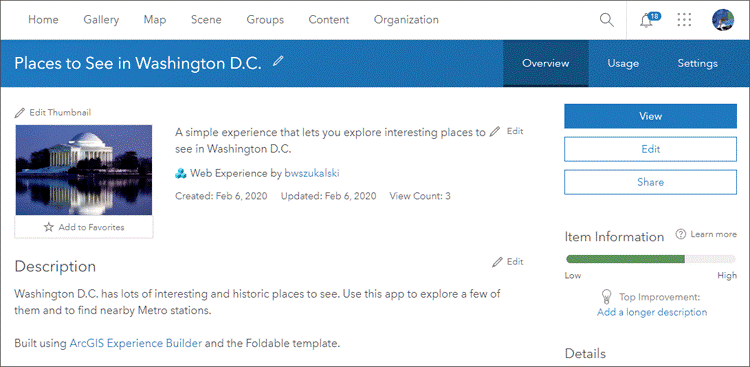
It’s a best practice to provide the item details for the experience by adding a summary, description, and thumbnail. You can edit the name, title, and thumbnail by clicking the options symbol on the experience card and selecting Edit info,or edit the item pages by clicking View details.
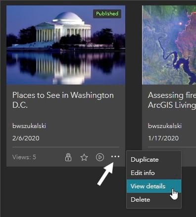
This is the completed item page.
For more information, see the following:
- ArcGIS Experience Builder
- ArcGIS Experience Builder Overview and Concepts
- What Is ArcGIS Experience Builder?
- Widgets Overview
- Create Your First Web Experience