ArcNews Online
Fall 2010
[an error occurred while processing this directive]Unemployment Trends Spotted by the Philadelphia Inquirer
Stories That Were Not Apparent Suddenly Pop Out with GIS
Highlights
- The jobless rate from the local government was geocoded and displayed by location on a map.
- The map showed editors and reporters exactly where the "story" was.
- GIS saved the newspaper time and resources.
The Philadelphia Inquirer's John Duchneskie says that finding a meaningful story can sometimes be more difficult than you would think. As the graphics editor for the daily newspaper serving the metropolitan area of Philadelphia, Pennsylvania, he works with the writing staff to investigate stories. Every day, the paper is tasked with finding news that will hook readers and keep them coming back for more.
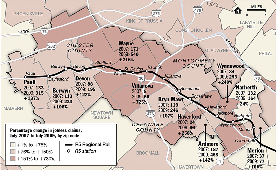
Though Philadelphia's wealthiest suburbs are faring better than other regions in the area, unemployment has risen dramatically along the Main Line.
Each afternoon, Duchneskie sits in a news meeting discussing the planned investigations and which stories will be considered. During one meeting, Jane Von Bergen, an Inquirer business writer, had an idea to take a look at unemployment, an area of focus for her. Von Bergen was interested in using Route 202, a main highway linking Pennsylvania and New Jersey, as a "clothesline" for individual vignettes about people who have been affected by the recent recession. Unemployment in four counties in the area exceeds that of the national average. Seven counties recorded increases larger than the national increase of 1.2 percentage points over the past year.
"In fact, all 11 counties have posted higher unemployment rates than the previous year," says Von Bergen.
When the recession began in March 2008, jobless rates ranged from 3.6 percent in Chester County to 6.6 percent in Philadelphia. Fast-forward to March 2010 and the unemployment rates for the three metropolitan divisions in the Philadelphia-Camden-Wilmington metropolitan statistical area were 10.4 percent (Bureau of Labor Statistics).
Duchneskie, who is a graphics designer, brought his laptop into the meeting loaded with ArcGIS, the software he uses to create illustrative maps, and data—including roads, county boundaries, unemployment, and demographic information—that would be relevant to the story. He hooked the system up to an overhead projector so Von Bergen and her editor could see the information. They started discovering trends, selecting areas, and querying data to see what was happening where. "Looking at the mapped unemployment data, we didn't see any real patterns that jumped out at us along Route 202," Duchneskie says. "What did jump out at us was the Main Line. The entire area had a high increase in the percentage of unemployment claims. Right away we could tell this was where the real story was."
The Main Line is an unofficial region of suburban Philadelphia made up of affluent towns first built along the old main line of the Pennsylvania Railroad. The Pennsylvania Railroad was the largest railroad by traffic and revenue in the United States throughout most of the 20th century and, at one time, was the largest publicly traded corporation in the world.
Towns that shoulder the Main Line include Bryn Mawr, Merion, and Overbrook, locations not normally associated with a discussion about unemployment claims. Gladwyne has the 14th highest per capita income in the country among places with a population of 1,000 or more. The eastern section of Villanova was ranked 39th in the Elite 100 Highest Income Neighborhoods in America with a median household income of about $367,000 (the Higley 1000).
Data displayed to investigate this trend included the rail line, Route 202, boundaries of the counties and towns, ZIP Codes within counties, and the information about the percentage change in the jobless rate from July 2007 to July 2009. Duchneskie used data included with ArcGIS and brought in jobless rate information from the local government. He geocoded the jobless rate information to the ZIP Codes and counties so it could be displayed by location on the map. Viewing the data, the reporters and editors saw there was an interesting pocket of change in employment in this area.
Finding that this pocket ran along the Main Line was intriguing. Duchneskie outlined towns along the main railroad line, and places typically containing homes with higher-than-average incomes lit up: Merion, Radnor, Wayne, Bryn Mawr, Devon. Continuing claims for unemployment benefits rose 50 percent from July 2007 to July 2009 in Philadelphia, according to state statistics. In the Main Line region, however, unemployment claims rose as much as 730 percent. As a whole, the region's claims rose 143 percent.
Finding this trend shifted the story's focus away from the highway to the railway. Once Von Bergen had a geographic focus, she went looking for real people to tell the story. She found them in a church support group for the unemployed: former bankers, executives, marketing managers, top sales representatives, and international investment directors—people with Main Line addresses and occupations that historically would not be thought to be affected by a recession.
"This is another marker that, unlike previous economic downturns that affected blue collar and young workers, this recession is affecting bankers and managers," notes Von Bergen. "Subsequently, we may be seeing a recovery taking a longer time than previously thought."
Using GIS to analyze the data to catch patterns and trends saved the newspaper time and resources. The team members were able to collaborate on their investigation while still in the office. Once they had a clearer picture of the story, they were able to pinpoint exactly where their photographer and reporter should focus their investigation.
"Without seeing the data in that manner, through the geography of it, we wouldn't have picked up on this trend," says Duchneskie. "We would have missed an important story."
More Information
For more information, contact John Duchneskie, graphics editor, the Philadelphia Inquirer (e-mail: jduchneskie@phillynews.com).
Related Podcasts
Geospatial Lens Adds Depth to Journalism
Steve Doig specializes in computer-aided reporting and is a Pulitzer Prize winner for his work on building code infractions uncovered by Hurricane Andrew. He discusses how GIS can enhance journalists' research and storytelling. Listen to the podcast. [14:00 | 13 MB]
GIS as an Investigative Tool in Journalism
Brant Houston, Knight Chair of Journalism, University of Illinois, Champaign-Urbana, discusses the need for GIS in media and journalism to help reporters uncover information that helps them tell better stories. Listen to the podcast. [12:00 | 11 MB]
GIS for Journalists
Andrew Long, founder of Longcreative and a former senior news artist at the Arizona Republic newspaper, talks about how GIS can add more visual punch and in-depth analysis to news and investigative stories. Listen to the podcast. [19:00 | 47 MB]