ArcGIS Business Analyst Web App and the ArcGIS Business Analyst extension in ArcGIS Pro have long been companion applications for spatial analysis. Business Analyst Web App is a go-to product for web-based GIS for users who want to understand communities, support business expansion, and identify market opportunities. It is updated three times a year, in line with ArcGIS Online product releases.
Business Analyst Pro, on the other hand, is part of Esri’s powerhouse ArcGIS Pro desktop software and is released for download twice a year. It extends the web capabilities with more advanced workflows, territory design, customer analysis, and more.
Because Business Analyst products are developed in tandem, workflows in one application often serve as inspiration for the other application. This is the case with color-coded maps, which was completely redesigned for Business Analyst Web App’s June 2023 release, including new geography controls for setting an analysis extent and defining the level of detail.

Not to be outdone, Business Analyst Pro unveiled the new color-coded layer workflow in the May 2024 release, as part of ArcGIS Pro 3.3. This new workflow takes inspiration from color-coded maps in Business Analyst Web App, but provides some new Pro-specific twists that push the needle even further on what users can do with multi-resolution choropleth maps in ArcGIS products.

This article walks through the basic similarities and differences between these two sister workflows in Business Analyst.
What is the same between the two workflows?
For users of this workflow in either application, much will feel familiar between the two. The speed, styling, and controls are virtually the same whether you’re working in Business Analyst Web App or Business Analyst Pro.
Map in (less than) a minute
A hallmark of color-coded maps and layers in Business Analyst is the simplicity of the mapping process: Use the data browser to pick a variable, and it’s mapped right away. This is the workflow that takes you on the most direct route from data exploration to compelling cartography.
To bring BA Pro’s color-coded layers in line with BA Web App’s workflow meant eschewing the traditional interaction with the Geoprocessing pane and guiding the user straight to the data browser, then to the group layer Symbology pane.

The group layer Symbology pane, in particular, packs a paradox: tons of horsepower and flexibility coupled with the sleek and user-friendly design well known from Business Analyst Web App. More on that in the next section…
Styling and substance
We all know maps should do more than look pretty…but it doesn’t hurt to have better cartography immediately, and the ability to enhance it further with a few clicks and tweaks. Color-coded layers in BA Pro have more styling options than ever, available right in the group layer Symbology pane that powers the workflow. Gone are the days of hunting for the individual layer Symbology pane, fumbling with the controls, and finding your changes applied to just one geographic level at a time. You can now change the symbology for all the sublayers—every geography level on the map/in the Contents pane—at once.

The straightforward style options in BA Pro unabashedly mimic the experience in BA Web App, and even take the styling experience a step further, borrowing from ArcGIS Online’s smart mapping capabilities. There is an array of blending, overlaying, and general sorcery available in Pro that will bring your data to life and let it tell a better story. In the end, that’s the main reason why users invest in Business Analyst in the first place!
Additionally, BA Pro color-coded layers employ smart mapping, discerning the best representational choice for the data variable being mapped. You still have access to ArcGIS Pro color scheme and method controls but by training the control on the data, BA Pro makes some intelligent guesses on how best to show the data. You can finesse the story being told by any layer by using the familiar Primary symbology controls in ArcGIS Pro by highlighting a geographic level in the table of contents.
One thing BA Pro users especially like is the ability to create consistent-looking maps for all geographic levels and then share them with ArcGIS Online or export to a Layer File or Package with all the symbology package up for the recipients.
Geographic control
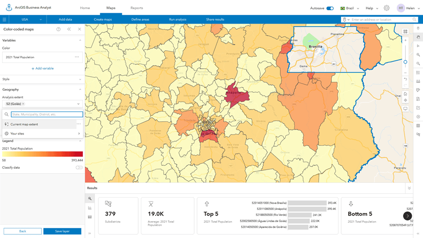
One of the headline innovations of the revamped BA Web App color-coded maps in June 2023 was the unveiling of new controls for setting an area of interest and level of detail for the map. You no longer need to create a map of the entire country and then zoom to find the location and geographic level you’re interested in. You can specify both from the start.

In BA Pro, the process is now similar: enter a place in the Area of interest search field and choose from available geographies that are returned. You can even add multiple geographies at once!

Once you have selected your area of interest type, say a ZIP Code or county, both BA Web App and Pro will only search for and return geographies of the same type. You can also use your own sites and geographic areas such as a customer-derived trade area, threshold analysis area, or custom polygon(s).
What is different between the two workflows?
There are some differences between the functionalities of color-coded layers and color-coded maps, which might inform which application you use. And—though you didn’t hear it from us—some of the differences may also delineate a roadmap for where color-coded layers in BA Pro go next.
Layers for individual geography levels
For color-coded layers in BA Pro 3.3, the workflow follows the traditional Pro pattern of creating a group layer containing multiple sublayers, one for each geography level. As discussed earlier, the group layer functionality allows you to style and work with the data all at once. But the opposite is also true: you can work with each sublayer individually as well.
This means you can use different color ramps, symbology, and classifications for each sublayer. For example, you could style the Total Population variable to display in ten classes with a red-to-yellow color ramp at the block group level, and in five classes with a white-to-maroon color ramp at the ZIP Code level.

Color-coded maps in BA Web App, on the other hand, are built on the fly, meaning the user must change the geography level manually to view different levels. It keeps things clean, but does lack some of the malleability instituted in BA Pro’s version.
Results pane
BA Web App users have been using the results pane with color-coded maps since June 2023. The results pane provides different ways to explore the map’s data, including a summary view, a histogram, and a data table.

This interactive pane offers multiple ways to explore and refine the data used in the analysis. BA Pro doesn’t have a results pane for color-coded layers, but there’s no telling what the future holds…
Bivariate mapping
The only thing better than mapping a variable in a color-coded map is mapping two variables in a color-coded map. BA Web App allows the selection of two variables, as well as the additional mapping styles this allows.

Color-coded layers in BA Pro 3.3 can be created using one variable at a time. There is still a rich spectrum of mapping that can be done with one variable! But it seems like bivariate mapping will be a great addition in future releases.
Local data versus online data
As of BA Pro 3.3, the color-coded layer workflow is available for use only with a local dataset (i.e. a dataset you’ve purchased and downloaded). There are plenty of perks—especially in terms of performance and credit usage—to creating maps with local data. But, compared to the worldwide online data coverage offered in BA Web App’s color-coded maps, it does represent a significant limitation for Pro users.
Summing it all up
Hopefully this article has inspired you to explore color-coded maps and layers in Business Analyst software. If you’re a Business Analyst Web App user, consider trying out color-coded layers in Pro. And if you’re a Business Analyst Pro user, you might explore color-coded maps in the web app. Both workflows are undergoing continual improvement, so keep an eye out for more color-coded goodness in future releases, and if you have ideas, share them!


Article Discussion: